Two reports just became one to make it even easier to see how your devices and accessories are performing.
To see how a device and its accessory perform together, you used to read two separate reports. Now you read one. The first examples are on our reports page this week.
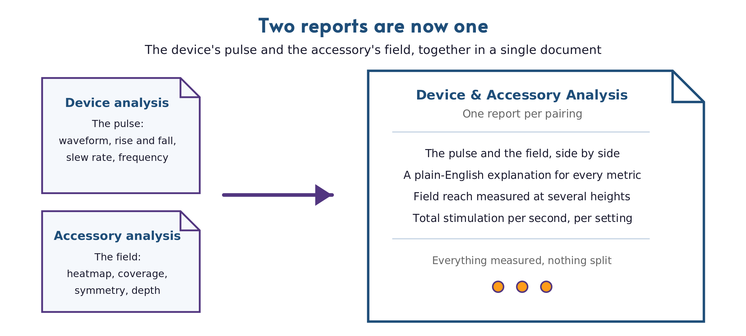
The pairing is what you buy, so the pairing is what we report.
A PEMF system is a device and an accessory working together, and the results depend on the pairing. The same accessory driven by a different device produces a measurably different field. The same device firing through a different coil delivers a measurably different result. Splitting the analysis across two documents asked you to rebuild that pairing in your head. You flipped between a pulse report and a field report to answer one question: what does this system actually deliver?
Our new report answers that question in one place. The pulse analysis (waveform, rise and fall time, slew rate, frequency) and the field analysis (heatmap, coverage, symmetry, falloff) sit in the same document, setting by setting, with the summary up front and the full measurement tables at the back.
We explain what every measurement means.
This is the change you'll feel first. Our report opens with four summary cards (slew rate, peak field strength, total stimulation intensity, and operating frequency), and each one starts with an everyday picture before it shows a value. Slew rate gets a hose: a sudden burst of water hits harder than a slow steady stream, even at the same pressure. Peak field strength gets a volume knob. You don't need a glossary open in another tab to follow your own report. The full definitions still sit at the end for anyone who wants them.
Two measurements appear for the first time.
Total stimulation intensity captures how much stimulus a setting delivers each second. The body responds to field change, and each pulse changes the field twice, once as it rises and once as it falls. This measurement adds up both edges and multiplies by how often the pulse fires. Two settings with the same peak can deliver very different totals, so this is the value that captures what a setting delivers over time, not just at its sharpest instant.
Penetration depth reports how far the field reaches above the accessory surface before it fades below 5 Gauss, the practical edge of its reach. The new scan measures the field at several heights, not just at the surface, and the report draws the reach as a volume you can see (measured in open air, modeled beyond the scanned heights; the reach through tissue is shorter). For anyone who's ever asked "how deep does it actually go," there's now an answer on the page.
Every unit is a little different, and the report says so.
Every electronic device varies from unit to unit. The components inside are each built within a tolerance range, and together they typically produce a 10 to 20 percent difference from the documented specification, up to 30 percent in some cases. Our report explains this in plain terms and notes that its numbers describe the specific unit on the bench. Another unit of the same model lands in a similar range, not on the exact same figures. That context is what turns a measurement into something you can actually judge.
To be clear about what hasn't changed: certifications stay the same. The Device Certification and the Accessory Certification remain separate listings on the public registry, and a combined report references both numbers. The testing behind the report didn't change either. What changed is the document you read.
The example reports page already shows the new format.
The examples live where they always have; the page didn't move. Two pairings in the new format are up now, a handheld paddle and a high-intensity strip coil, both tested on equipment we purchased for in-house use. Read one end to end. It's a few minutes, and it's the fastest way to see what a complete, plainly explained analysis looks like.
Read the new report before you commission one.
The examples show exactly what your finished report looks like: one document per pairing, a plain explanation beside every measurement, and values another lab could verify.
Schedule a Call See Example ReportsThe measurements didn't change, and neither did the bench they come from. What changed is the reading: two documents became one, and the one explains itself.