
Three new ways to look at a measured field: slice it open, scrub its pulse, and set it beside a real body.
The 3D viewer already lets you rotate a device's measured field and play its pulse. We have added three more ways to look closer, because the questions a buyer actually has are easier to answer when you can see them: how deep does the field go, what does the inside look like, and how big is this against a person. Each one works from the same measured scan, not an illustration.
Slice the field open with a cross-section.
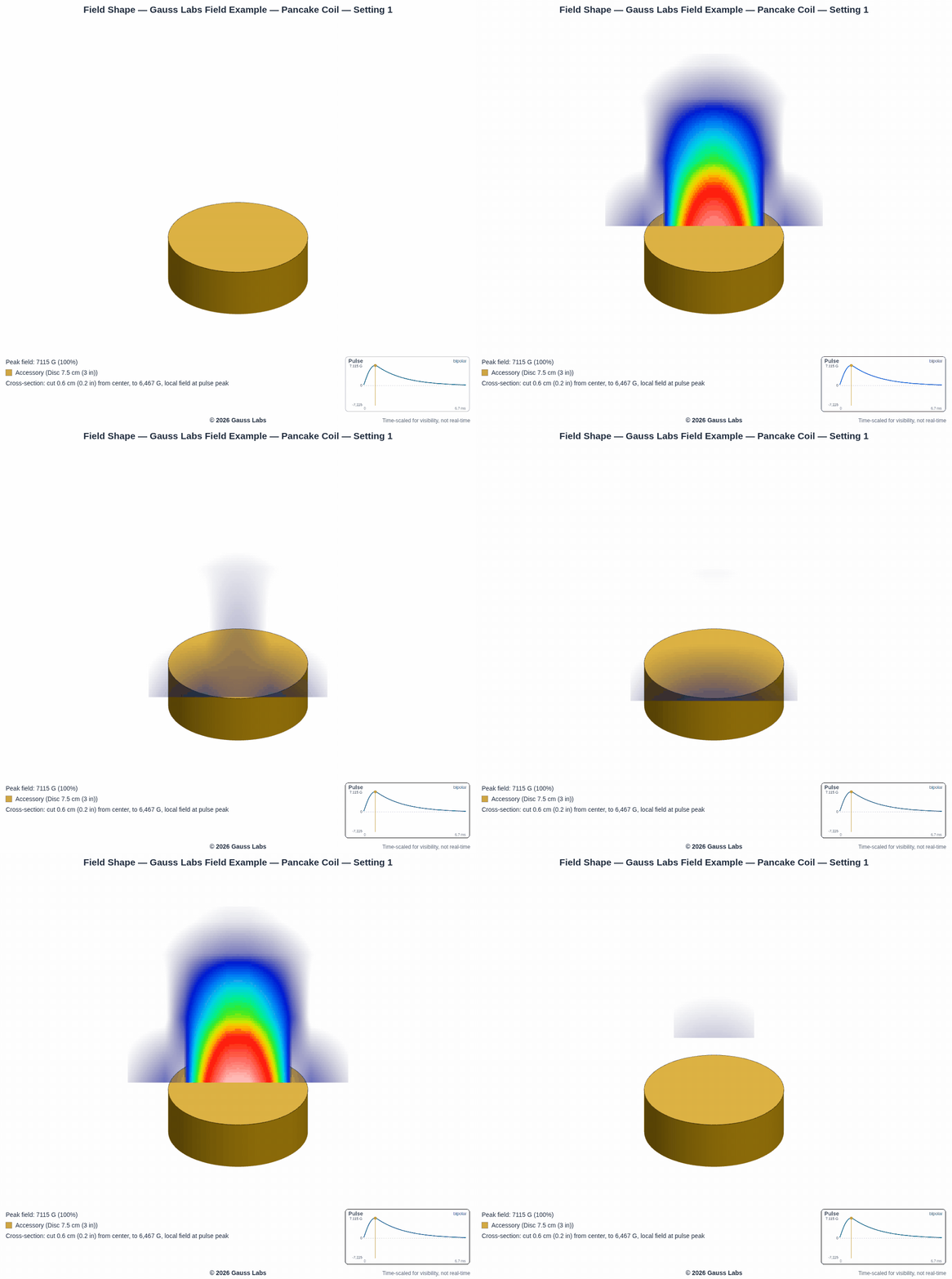
The dome and the topographic map show the field from the outside. The new cross-section view cuts straight through it, so you see the inside of the field as a flat slice colored by strength, hottest near the surface and cooling as it fades outward. You can move the cut through the field and swing its angle, so instead of reading the reach off a shell you look right at the field on the plane you care about. The slice animates with the pulse too, so you watch the interior rise and fall in time with the waveform.
Scrub the pulse to any moment you want to study.
The field is not one shape. It grows and collapses through each pulse, and on a bipolar setting it swings above zero and then below. The new timeline slider lets you stop on any point in that cycle instead of only watching it play. Park it at the peak to see the field at its fullest, step to the moment the pulse crosses zero, or hold the dip on a bipolar swing. It is the difference between watching a pulse go by and freezing the exact frame you want to look at.
See the field against a real body.
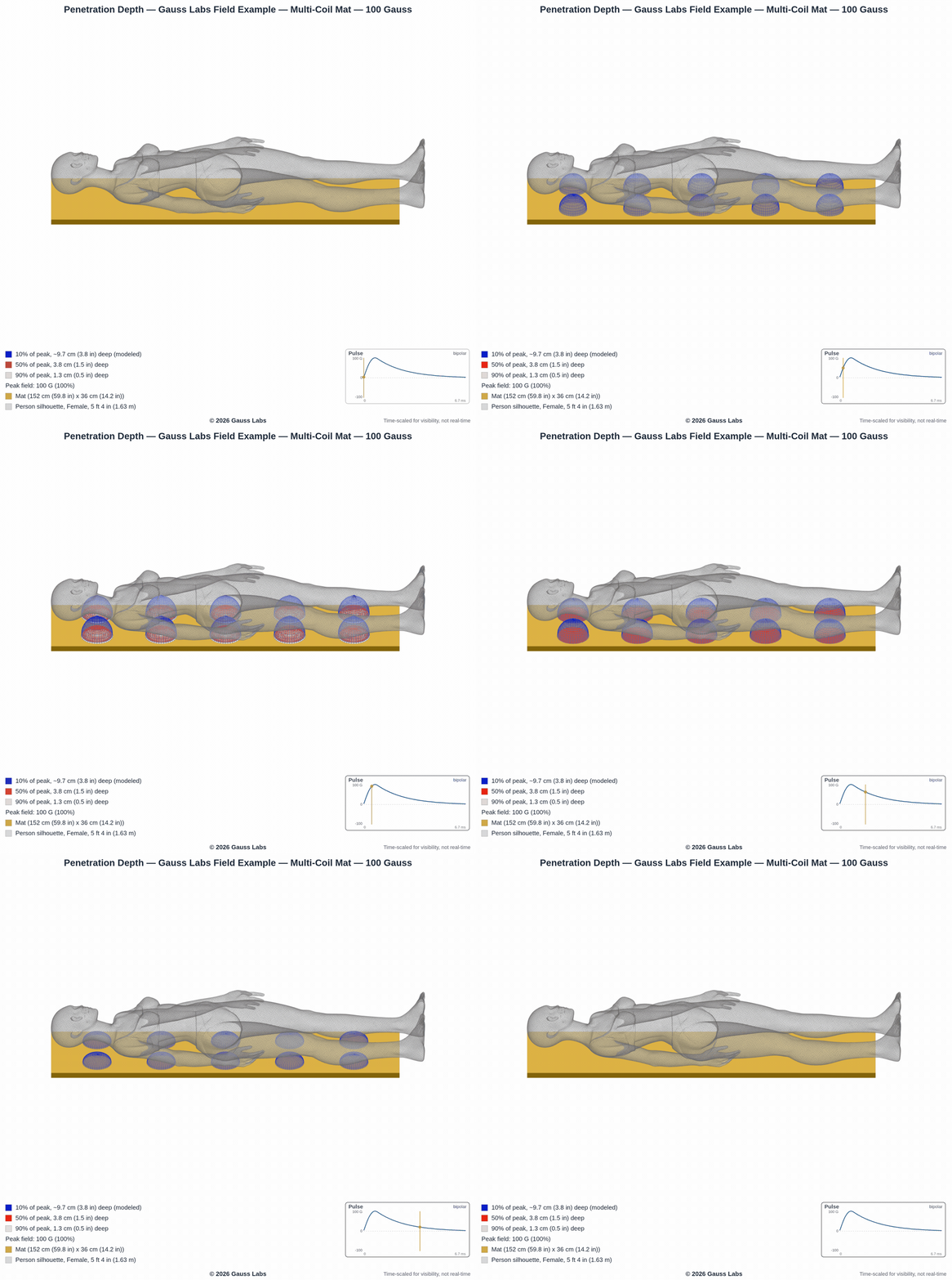
Depth is the hardest thing to picture from a spec sheet. So on the mat view you can drop in a full-scale person, a man at 5 ft 9 in (1.75 m) or a woman at 5 ft 4 in (1.63 m), lying on the pad. Each coil's field rises off the mat and into the body, and against a real torso you can see how far the usable part actually reaches, and how much of the person a mat that size covers. A single Gauss value never told you either of those. Here they are something you look at.
Why we keep building these.
All three come back to the same idea: the more of a field's shape you can see, the less you have to take on trust from a single number. The cross-section shows the inside, the timeline shows the field through time, and the figure shows it at the scale of the person who will use the device. Every pixel traces to the scan we ran, the same measurements behind the report's charts and the two boundaries we wrote about in where a field stays strong and where it fades out. If you missed the viewer itself, start with the measured field in 3D, then come back for these.
Want your device's field shown like this?
When we test and certify a device, the measured scan becomes the report, the charts, and this interactive 3D field, cross-section, timeline, and all. Our example reports are open to explore.
Schedule a Call See Example ReportsA measured field holds a lot that a single value hides. Slice it, scrub it, or stand a person next to it, and what could not be seen is now visible.