
You can now rotate a device's measured field in 3D, and watch it pulse.
A report presents the field as values and charts. That is precise, but a field is a shape in space, and a table leaves you to build that shape in your head. So every example report now carries an interactive 3D viewer, built from the same scan behind the numbers. You can rotate it, zoom in, switch between two views, and play the device's real pulse. The newest addition is the topographic map, and it shows something different from the view beside it.
The field dome shows how far the field reaches.
The dome view stacks a few isosurfaces, the shells where the field holds at 10%, 50%, and 90% of its peak. Here height means physical depth, so each shell shows how far off the accessory the field stays at that level. The 90% shell hugs the surface, and the 10% shell reaches the farthest out, which is the field's reach. This view has been in the reports for a while, and it just picked up a round of quality improvements, so the shells read more cleanly and the accessory sits in proper scale beneath them.
The topographic map, new this week, shows how strong the field is across the surface.
The topographic map is the new view, and it turns a measured layer into a colored terrain where height means field strength rather than depth. The center rises to a white peak, drops through red at half of peak, and runs down the same color ramp the report heatmap uses, out to the dark ground where the field falls below one percent. Because it is drawn on a logarithmic scale, the weak field past the accessory edge still shows as low relief instead of vanishing, so you see the whole falloff at once. You can also switch the measured layer, from the surface down to a few centimeters deep, and watch the terrain flatten as the field spreads and weakens with distance.
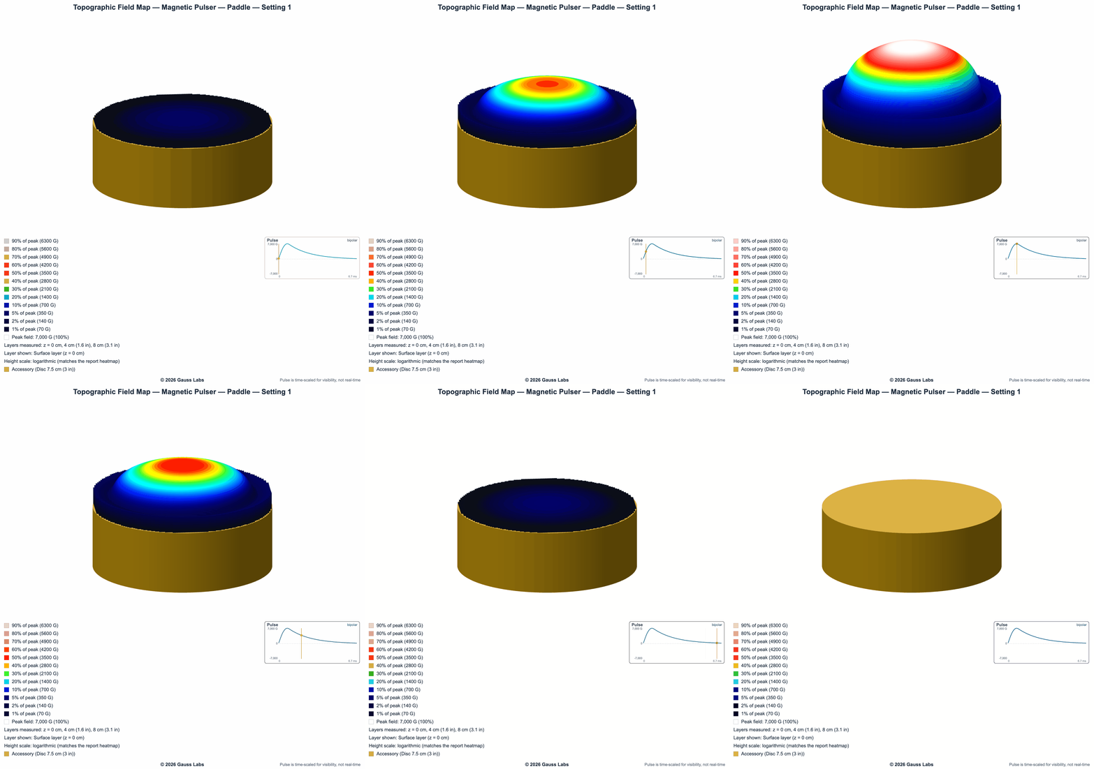
Play the device's real pulse, not a generic loop.
Both views can animate, and the motion is the device's own measured waveform, not a stand-in. Press play and the field rises and settles in time with the captured pulse. On a setting whose pulse is bipolar, the field swings above zero and then below it, so a shell can swell twice in one cycle, once at each peak, which a still image can't show. A scrub bar steps through the cycle by hand, a speed control slows it down, and the viewer will export the animation so you can add it to a slide or a page. That export is how we made the clip above.
A measured field in 3D is not a picture of one.
Marketing pages often show a smooth field render or a glowing coil, drawn to look impressive rather than measured. The viewer is the opposite: every shell, every color, and every frame comes from the scan we ran on the device, on the same values the report publishes. For a buyer, that turns two hard questions into something you can see. The dome shows how far the field reaches, and the topographic map shows how strong it is where you place the accessory, the two boundaries we wrote about in where a field stays strong and where it fades out. For a manufacturer, it is a shareable piece of the certification, the measured field made tangible for the people deciding whether to trust it.
You can open it yourself: visit the example reports, pick a device, and choose "Explore the measured 3D field." Rotate it, switch to the topographic map, and play the pulse.
Want your device's field shown like this?
When we test and certify a device, the measured scan becomes the report, the charts, and this interactive 3D field. Our example reports are open to explore, viewer included.
Schedule a Call See Example ReportsA device's field is a shape in space. Now you can rotate it, read its strength off the color, and watch it pulse, instead of assembling it from a single value.